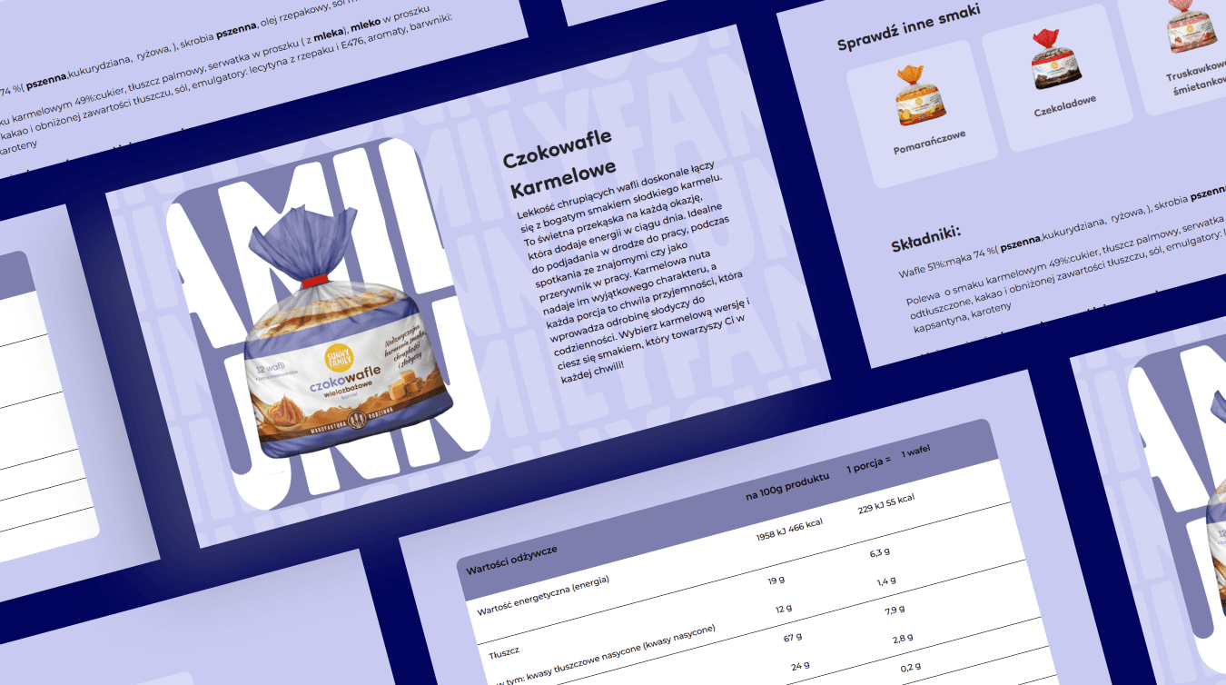
A light and engaging brand showcase - a Webflow site created for Sunny Family.
UX/UI, Web development
See the LIVE project
Umów się na bezpłatną konsultację
Twoje dane przetwarzamy zgodnie z naszą polityką prywatności.
The goal of the project was to create and implement an aesthetically pleasing, transparent and functional platform that would effectively reflect the nature of the products offered - natural, light and family-friendly. The project focused on an optimal combination of visual values and practical functions, so that customers could easily manage the content.
Challenge
The goal for this project was to create an aesthetically pleasing and functional website that:
- Presents product offerings in a visually appealing and easy to browse manner.
- Gives the user quick access to nutritional information and product composition.
- Provides visual consistency and a fresh look that is consistent with the brand's visual identity.
- Allows the client to intuitively manage content and expand the catalog using the CMS.
The biggest challenge was to achieve a balance between aesthetics and functionality - to create a product catalog that is as visually appealing as it is easy to manage and readable for the user.

Solution
Boring Owl's team designed and implemented a comprehensive solution based on Webflow technology:
- UI/UX Design: Designed the site with a clear structure, using a white background and pastel accents to reflect the natural character of the products.
- Web Development: The implementation was done using the Webflow platform, which allowed rapid transfer of mockups to the real environment and the addition of interactions, such as a slider on the homepage and micro-animations at interactive elements.
- CMS: A content management system was created, allowing the client to easily add and edit products, while ensuring a consistent, pre-designed product page layout.
- Responsiveness: We paid extra attention to adapting the site to mobile devices, including optimizing the nutritional table, which was designed to remain fully readable, even with limited screen space.
Key Features
- Dynamic homepage with interactive slider and intuitive navigation.
- Responsive product catalog with consistent content layout.
- CMS system allowing easy addition and editing of products
- Clear product page with simple description, clear images and responsive nutritional table.

Results
- A modern and fully responsive website that captures the character of the brand.
- Improved readability and accessibility of product information on all devices.
- Simplification of the process of adding new products thanks to a flexible CMS.
- Attractive presentation of the offer.
Summary
Sunny Family is an example of a successful combination of aesthetics, functionality and thoughtful information architecture. By using Webflow, we were able to create a site that not only effectively presents the client's products, but also reflects the brand's values. This project is an excellent example of a modern online catalog - light, transparent and ready for further development.

