

- CLIENT:
- Konsorcjum Migracyjne
- INDUSTRY:
- Education / EdTech
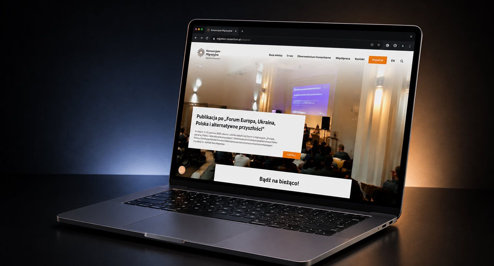
A new website that makes it easier to reach donors and people looking for help
Project summary
LIVE PROJECT- CLIENT
- Konsorcjum Migracyjne
- INDUSTRY
- Education / EdTech
- TEAM
- UX/UI Designer
Results
The work of 9 organizations in one place
a clear overview of everything the consortium does
An easier way to support the organization
a clear narrative that leads donors to take action
Content edited by the organization's own team
custom fields in the CMS, no technical help needed
Higher search engine visibility
thanks to SEO and performance optimization
CHALLENGE
The main idea was to create a clear website that:
- Makes it easier to find information about the Consortium's activities and goals.
- Strengthens the organization's image as an expert on migration.
- Encourages donors to support the initiative.
The challenge was designing a website that presents a wide range of activities and content for different audiences in a clear, accessible way.
SOLUTION
The Boring Owl team ran a complete design process, covering workshops, design and development:
- Design workshops: We started by gathering information about the goals and requirements of the Migration Consortium (Konsorcjum Migracyjne). During the workshops, we set priorities and guidelines for the site structure, user interactions and tailoring content to different audiences.
- Design:
- Low-fidelity mockups - covering the initial content structure, sample images and the color palette.
- High-fidelity mockups - applying the organization's full visual identity, with colors, typography and layout matched to the Consortium's character. Diagonal lines and elements of the logo add a sense of lightness and movement.
- Development:
- The site was built on WordPress, because the client's team already knew this CMS.
- Bricks Builder was used to build graphic components and page layouts.
- Custom HTML/CSS/PHP templates were developed based on the approved mockups.
- The CMS was extended with MetaBox, adding text, image and date fields that give the client full control over the content.
KEY FEATURES
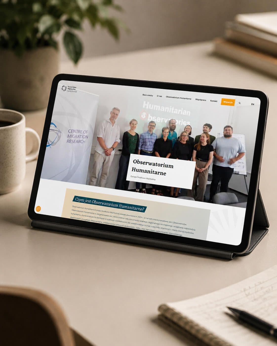
- A simple, clear structure spread over a small number of pages.
- A visual design fully in line with the Consortium's visual identity.
- An intuitive CMS with custom fields for editing content.
- SEO and performance optimization.
RESULTS
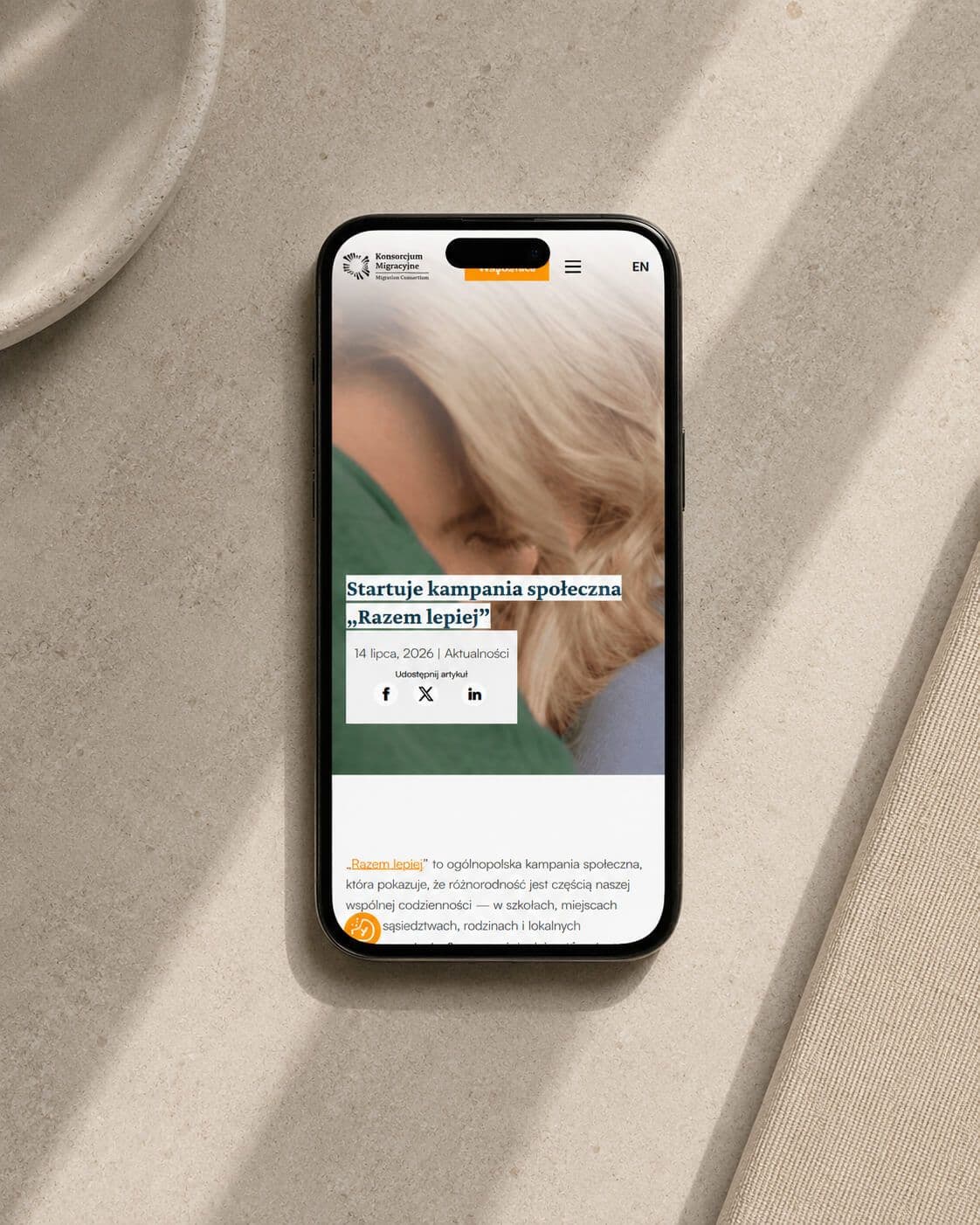
- A platform with consistent visuals and content that supports the Consortium's work.
- Easier contact with donors and partners thanks to a clear structure and an engaging narrative.
- A much more efficient content management process thanks to a user-friendly CMS.
- Greater online visibility for the Consortium thanks to technical optimization and SEO.
SUMMARY
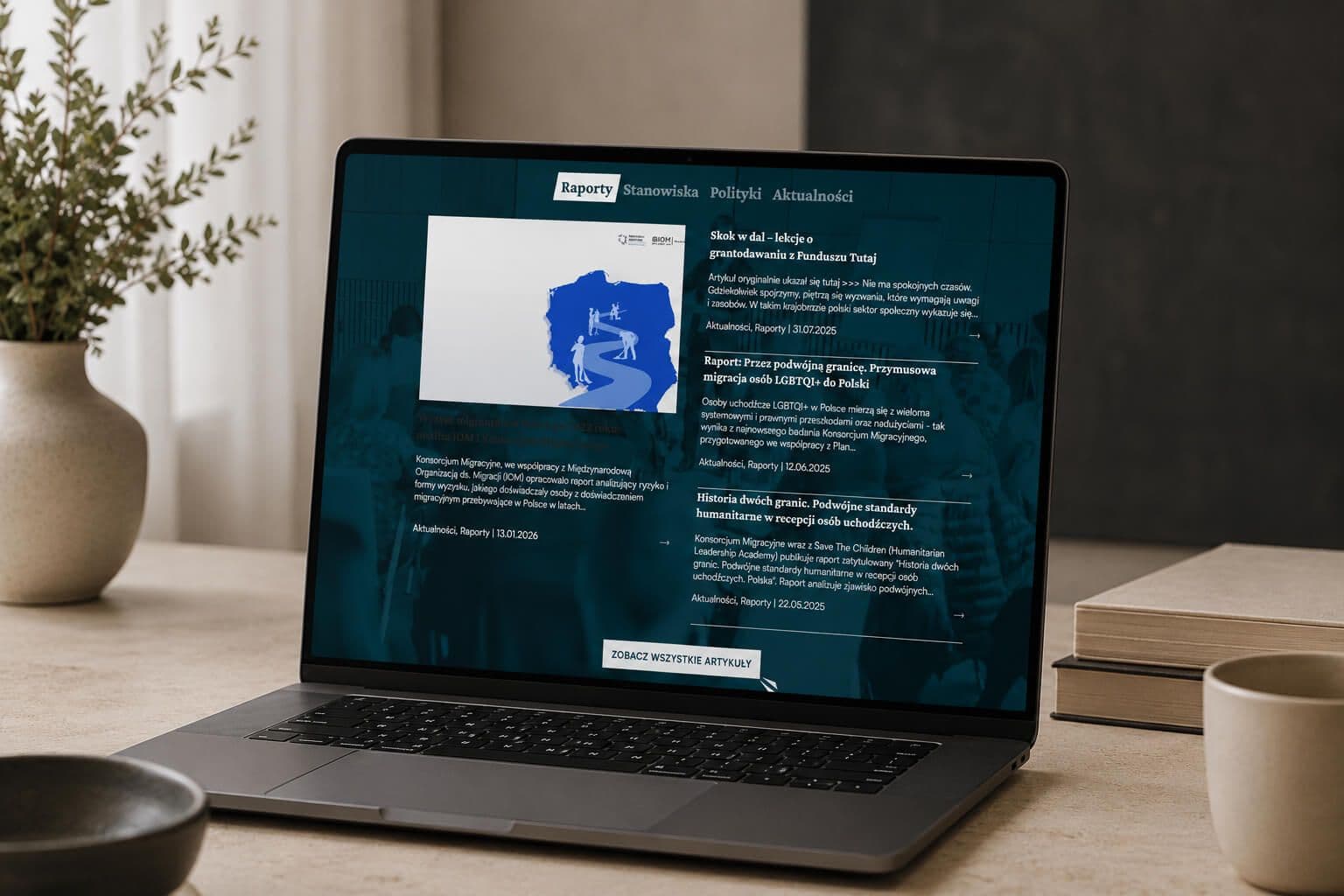
The Migration Consortium website is an example of a modern solution that meets the needs of an organization working on migration. With a well-thought-out structure, simple design and WordPress as the platform, the site gives users easy access to the most important information while supporting the organization's fundraising and its authority in the field of migration.
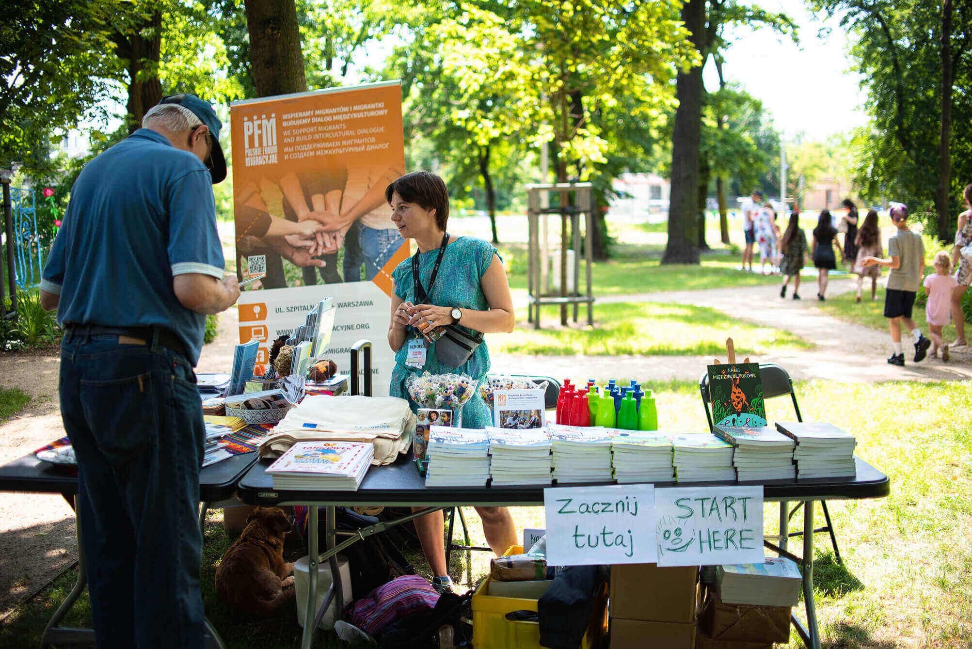
Technologies used
- PLATFORM
the system the whole website is built on
- FRONTEND
custom templates matched to the visual design
- BACKEND
WordPress template logic
- ANALYTICS
conversion and event tracking
- INFRASTRUCTURE
serving images through a CDN
Similar case studies
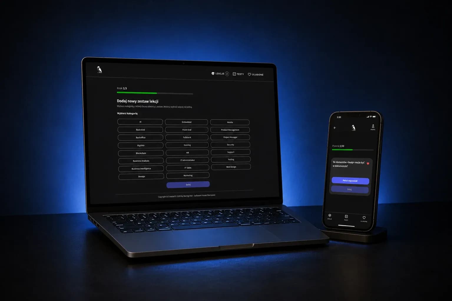
An educational platform that generates programming study materials with ChatGPT
Client: Klient (Aplikacja webowa do nauki programowania)
Industry: Education / EdTech
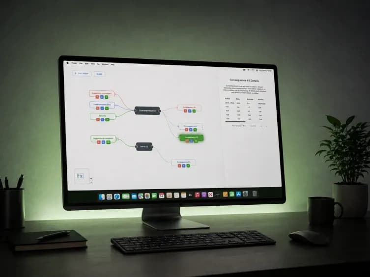
An interactive relationship map that speeds up scientific literature analysis
Client: Klient (Mapowanie badań naukowych)
Industry: Education / EdTech