Research

We analyzed the structure of the old site, conducted research on the industry and reviewed the websites of Polish and foreign companies involved in HR services. From this stage, we engaged the client, working out together the direction we would take, evaluated what elements of the current site and visual identity we would like to keep, and discussed how we intended to refresh its character.

1.png

Workshop

We held a workshop where, among other things, we discussed in detail the prospects the company wants to target, their needs, problems and concerns. We decided to divide the sub-pages with HR Hints' offerings in two ways - first, because of the cooperation packages: Recruitment and Team Management, and secondly by the groups they target: Startup/Scaleup , Investor and Entrepreneur. Such precise addressing of the needs arising from the different specificities of clients' companies was aimed at expanding the group of customers in the future - so far HR Hints has been gaining new customers in the Startup environment, where it is recognized and valued.

2.png

Designing in Figma

After the workshops, we analyzed the potential user paths and based on them we created the information architecture of the new site. We also already knew exactly what was most important to us in the new version of the site - we wanted to show a more personalized offer, to structure and visually diversify the content - to give it a visible division into sections, to make sure that the sub-pages were different from each other. We also wanted the site to become lighter, and decided to lighten the color palette, abandoning large swathes of navy blue and gloomy beige in favor of luminous light backgrounds and imitating glass transparency (glassmorphism). We took advantage of illustrations previously created for the brand, but showed them in a fresh new look.

3.png4.png

Development in Webflow

Due to the lack of complex functionality, we decided that the site would be built using No Code technology in Webflow by our design team.

When designing elements for the site, we relied on the Relume component library for Webflow, for which an analogous library is also available in Figma - this allowed us to later efficiently transfer visual designs based on Relume components and processed by us from Figma to Webflow using ready-made responsive "skeletons" for which our designs were also already prepared.
After the client accepted the first mock-ups of the most important pages, such as the home page and the sub-page of the offer dedicated to particular personas, we started preparing the working environment in Webflow.  The first step was to connect Relume with Webflow. Using the section library greatly improved and accelerated our work.

5.png6.png

Animated micro-interactions

We've used subtly animated micro-interactions on the site, which make the site more engaging for the user and add lightness and character. The homepage header swings when hovered over with the mouse, the tiles next to it zoom in slightly and also move gently when hovered over, the mouse cursor is tracked by a light orange aura reflected on the glass tile-like header. Buttons, of course, also have their states designed with a slight animation on hover (mouseover). The menu opens in a smooth manner and when opened, the content of the page gently peeks out from underneath. Navigation also appears at any point on the page when you scroll up. Sections on the home page smoothly animate when the user first scrolls through them. The use of many such small procedures makes the user's interaction with the site flavorful and simply enjoyable. All interactions have been pre-built in Webflow.

7.png

Cooperation with the client

During the work, we were in constant contact with the client to consult impressions and comments related to the site on an ongoing basis. Smooth communication allowed us to agree on changes regarding the color scheme, which initially did not fully reflect the nature of the personas.
 

At this stage of work, we focused simultaneously on creating the site in webflow and continuing to work in Figma on the subsequent pages. The scheme of our work was as follows:

  • designing subpages in figma
  • consultation of mockups with the client
  • making any corrections and consulting again
  • transferring the final view to Webflow
  • consultation with the client
  • making corrections.
     

However, the above scheme was not performed linearly point by point. Designing in Figma and Webflow, at this stage of the work, was done in parallel, which allowed for greater efficiency.


Challenges in the project

Responsiveness of all views was an important aspect of creating the site. Some of the sections that were used from the Relume library were ready in this regard as well. Other sections we adjusted by ourselves appropriately for tablet and phone resolutions.

An important issue from the client's point of view was the possibility to edit the content and later create sub-pages from ready-made sections on their own. This matter was considered and resolved in several ways.

  • CMS

Some of the content (e.g.: customer recommendations, case studies, customer logos) was created based on the CMS collection. In the case of customer reviews and logos, we had to adjust the filters accordingly and use conditional displays so that the relevant reviews would display in the right places.

8.png

  • Editing content and moving sections

The second way of editing was simply changing content manually in individual sections. Some actions, however, required client to use the full webflow panel such as: copying and moving sections to another location.


Both solutions were presented and explained to the client so that he could use these functionalities himself in the future. Once all the subpages were designed, the final step was to publish the site and add an English language version.


Summary

Analyzing the course of the entire project it was an interesting challenge that had to be met both in terms of design and functionality of the site. Thanks to the lighter design, more content could fit on the site, compared to the original version. The content was also more organized. Involvement in the project on both sides resulted in an effective and efficient process.

See the LIVE project
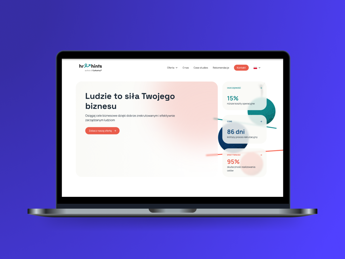