Umów się na bezpłatną konsultację
Twoje dane przetwarzamy zgodnie z naszą polityką prywatności.
What the client wanted was to emphasize the credibility of the company by showing the people behind the company. In addition, a lot of focus was placed on the factuality of the content presented, which also helps build a reliable image of the company. Our task was to visually represent values important to the client, such as transparency, simplicity of the message and building trust by showing accuracy and awareness in corporate restructuring activities.
Discovery stage
The stage with which we began work on the project was the discovery phase, which included a competitor analysis, workshops with the client and work on the structure of the site. The competitor analysis was based on two aspects: functional and visual. In the first case, we focused on reviewing the solutions and structure used on other sites. In the case of the analysis from the visual aspect, we focused on reflecting the value and message in the design of the site. In the case of our client, we had a brandbook provided, in which the color scheme and logotype were specified, which influenced the final appearance of the site, so that the whole was consistent with the prepared visual identity of the company.

The workshop with the client was mainly based on learning the vision for the company and understanding the services it offered. It was also important to understand the needs and concerns of potential users visiting the site. The information learned from the workshop was translated into the structure of the site, which included a breakdown of the most important subpages, and also showed the future development of the company, as some pages were planned and designed for the future.

Design
This stage consisted of creating lo-fi mockups, which, after approval on the client's side, were converted into hi-fi mockups. Since the project was implemented on Webflow, we used the Relume library, which has integration with both Figma and Webflow, to design the low-detail mockups. The use of such a solution influenced the speed of execution of the project, as well as unification and consistency in appearance.
The creation of low-detail mockups was aimed at presenting the functionality of the site, which allowed us to better refine the structure of specific subpages.

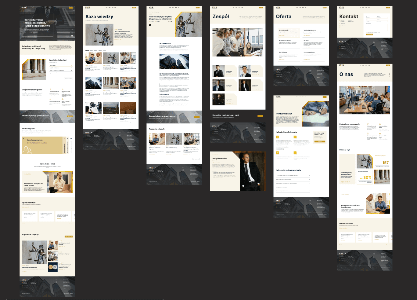
After determining all the functional needs, we moved on to the high detail mockup design. Here we already focused on the visual aspect of the site, creating an impression of credibility using the visual identity provided to us. The process was based on designing several versions of each sub-page, from which we could ultimately choose the most suitable to the client's requirements and design. The final versions are based on a combination of photos depicting employees or the company's headquarters and a subdued color scheme, which has its source in the previously prepared logotype. A light, delicate shade of beige alluding to the gold in the logotype allowed for the introduction of a gentleness that gives the impression of care and calmness. Gold accents on the images or buttons allowed to highlight important content, and they also add dynamism and variety. Maintaining a consistent and subdued color scheme with small accents indicates professionalism and dynamism in the company's department. The overall design is simple and traditional in perception and the small details introduce a modern look.

Development
Development was carried out on Webflow. This stage was tasked with bringing the site to life by mapping out mockups, adding interactions and ensuring responsiveness. It was also important to create a CMS in which it would be possible to add and edit all the content that was based on the template i.e. content on the services page or content related to team members. Pages that the client will be able to activate in the future such as customer reviews and completed cases were also implemented.
Previous project
Sunny family

